
IELTS Writing is about composing 2 assignments within 60 minutes. First assignment has to be composed in 150 words, and candidate must not exceed 20 minutes for the composition. The second assignment is about composing an article of 250 words on a given subject. The optimum time to burn for this assignment is 40 minutes. This assignment has more weight-age than the previous one. In general, the IELTS Writing has different structure for the candidates of Academic & General Training (GT).
To ease the learners in understanding the format of a 9 band writing, a clear description including all the four parameters of writing is provided either it is Task 1 or Task 2. Here, two solved samples of each type are available from where learners can get the ideas to implement in the unsolved task questions which are given on either sides. It's time to enhance your base of writing by learning the high range vocabulary and the sentence variations.

The given line chart details the percentages of people attending concerts from 2010 to 2015 across various age groups. Looking from an overall perspective, it is readily apparent that all ages showed increasing trends except for 55-64 and that younger people tended to go to concerts more often.
52% of those between the ages of 45 and 54 went to concerts in 2010, leading all age brackets, but there was a dip to 40% in 2011 which allowed the 16-24 groups to rise 15% to 55% and lead all concert-goers. From there, both groups increased with broadly similar trends as the 16-24 year olds had risen to 70% by 2015 and the former group had grown to 54%.
The 25-44 and 55-64 groups showed inverse trends with the former group dipping from 40% in 2010 to a low of 30% in 2013 before sloping upwards to nearly 50% by the end of the period. The latter group rose steadily from a starting point of 20% to intersect with the younger group at 30% in 2013 and then fell to just over 20% in 2015. The final group, aged 75+, doubled to 20% in the first year, had surrendered those gains by 2013, before undergoing a stable increase and reaching 20% to finish the period.

Model Answer:
The line graph illustrates how many students of Vietnam were educated in three different countries over a period of 15 years.
It is clear that while the average number of Vietnamese students in America and France increased significantly. The opposite was true for Russia. In addition, the figure for America experienced the highest rise.
In the year 2000, there was an average of nearly 3,5 and 3 million Vietnamese students in France and Russia respectively compared to only 1.5 million students choosing America education. Over the next five years, the number of students in both France and Russia witnessed a steady fall, there were 2.5 million in France and 2.2 million in Russia. By contrast, the average number of Vietnamese students in America rose gradually, equal to Russia.
In 2010, the number of students studying in America surpassed that in France and Russia, stood at 3 million students while Russia continued falling in the number of students, 1.8 million. There was stability in the figure for France during the same period. From the year 2010 onward, all the countries saw a rise. To be specific, the average number of students in America and France increase considerably, 6 and 5.5 million Vietnamese students respectively. The figure for Russia was 2.5 million students.

The line graph compares the visitor activity on two music websites over a 15-day period. The number of daily visits are given in thousands.
Overall, both websites experiences an upward trend. The music website "Pop Parade" was by far the more popular choice over the time period, starting out with three times the number of visits compared to "Music Choice" and finishing at double the number of visits. However, there was a short time period of two days where "Music Choice" trumped "Pop Parade".
Being the generally less popular website of the two, Music Choice started out around 20-40 thousand visits per day and remained at that level with only slight fluctuations until a sharp increase in the number of visits on day 12, when 120,000 visitors were recorded. Numbers plateau at this level for 3 days before they fell sharply to less than 80,000 on day 15.
The activity on the "Pop Parade" website showed an overall higher level of variability, starting out at 120,000 visits, then decreasing steadily to less than 40,000 on day 7 and rising again sharply to reach 150,000 on day 11. This was followed by another dip and subsequent sharp increase before peaking at the end of the time series, recording more than 160,000 visits per day.
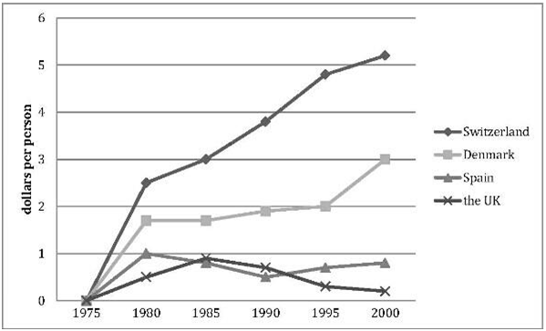
The line graph compares how much these four countries spent on the research of renewable energy during the period from 1975 to 2000.
In 1975, there were no countries budgeting for this research, while the spending from Switzerland, Denmark, Spain and the UK reached 2.6, 1.8, 1 and 0.5 dollars per person respectively in the year 1980.
In the following year, the figure for Switzerland nearly doubled, rising from 2.6 to over 5 dollars per person. The investment from Denmark almost leveled off from 1980 to 1995, after which it rose remarkably and arrived at 3 dollars per person in the year 2000.
When it comes to Spain, the spending dipped to 0.5 dollars in 1990, although it climbed again and ended up at 0.8 dollars per person in 2000. The investment form the UK peaked at 0.9 dollars per person in 1985, while it was the country which spent the least researching the renewable energy.
Overall, Switzerland was the country that allocated the most funds to the research of renewable energy, while the allocation from the UK was the lowest.
Answer:
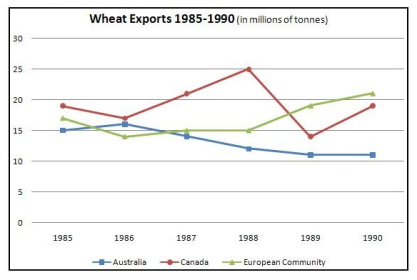
The three graphs of wheat exports each show a quite different pattern between 1985 and 1990.
Exports from Australia declined over the five-year period, while the Canadian market fluctuated considerably, and the European Community showed an increase.
In 1985, Australia exported about 15 millions of tones of wheat and the following year the number increased by one million tones to 16 million. After that, however, there was a gradual decline until 1989 and 1990 when it stabilized at about 11 million tones. Over the same period, the amount of Canadian exports varied greatly.
It started at 19 million tons in 1985, reached a peak in 1988 of 24 million, dropped dramatically in 1989 to 14 million tones and then climbed back to 19 million in 1990. Seventeen million tones were exported from the European Community in 1985, but this decreased to 14 million tones in 1986 and then rose to 15 million in 1987 and 1988 before increasing once more to 20 million in 1990.

The provided bar graph illustrates the information about the proportion of overweight male and female in Australia between 1980 and 2010.
Overall, in 1980, it can be clearly seen that men were the most obese which was overtaken by the female with the passage of yearns.
On analyzing the bar chart, it has been witnessed that during 1980, the heftiest proportion of overweight men stood at 40 which was nearly 10 percent more as opposed to the women. After a decade, this value for rose gradually approximately by 12 percent in former and about 12 percent for latter.
However, in 2000, there was a mild incline in the percentage of obese men and women as both reached to just 75 and 52 respectively. Whereas, from 2000 onwards, the rate of male having high weight experienced opposite trend as it fell down slightly to 60 while similar figures for female prevailed consistency at 52%.
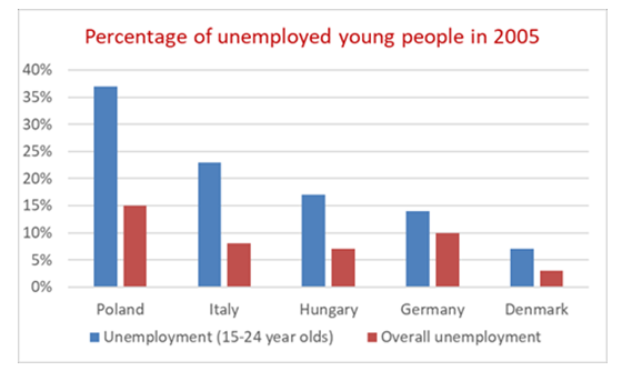
The bar chart provides information about the unemployment rates of young adults aged 15-24 and that of the total workforce in five European countries in the year 2005.
Looking at the proportion of jobless young adults, the lowest figure was recorded in Denmark (just over 5%). Germany and Hungary had approximately three times higher youth unemployment rates compared to Denmark. The highest unemployment rates were observed in Italy and Poland, about 23% and 37% respectively.
As regards the overall unemployment rates, Poland witnessed the highest figure in this category as well. Fifteen percent of the Polish workforce was jobless while 5% fewer people were idle in Germany. Italy and Hungary came next with similar levels of overall unemployment, nearly 6-7%. In comparison, Denmark had only around 3% unemployed people.
In general, what stands out from the chart is that the youth unemployment rates were significantly higher than the overall figures in all the listed countries. Poland ranked the first in both the categories while Denmark came last. Italy and Germany were in the halfway marks with Hungary representing the overall mean.
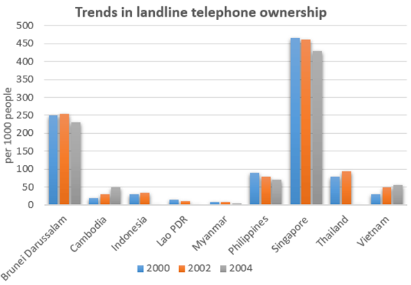
The graph shows the number of telephones owned per thousand of the population in different countries over a five-year period.
Overall, the number of phone owners per thousand of the population varied considerably. However, numbers tended to fall in countries with the highest level of phone ownership, whereas numbers generally rose in countries which had fewer phone owners in 2000.
By far the highest level of phone ownership was in Singapore, where just under 430 people per thousand were owners in 2004. This figure is slightly lower than the 2000 figure of around 460 per thousand. In Brunei Darussalam the second highest levels of phone ownership were recorded, and the numbers fluctuated around the 250 per thousand level across the five years.
Countries like Cambodia and Vietnam had much lower levels of phone ownership and these increased up to 2004, rather than decreasing. In the remaining countries, the number of landline phone owners remained below the 100 per thousand level between 2000 and 2004.
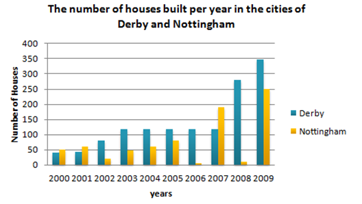
The bar chart describes the number of houses built in two neighboring cities, Derby and Nottingham, between 2000 and 2009.
Overall, the number of houses that were erected in Derby exceeded upwards the quantity constructed in Nottingham.
The trend for the former was decidedly upwards, with Derby experiencing a steady rise from 40 new houses in the first year, to just under 120 during the 2003. Over the next 4 years of decade, new houses construction in Derby remained constant at just under 120. This is in sharp contrast to the last two years when the number of houses that went up in Derby leapt, first to 280 and then to 350 houses.
Houses building in Nottingham, by comparison, were much more erratic. In the first two years of the decade, more houses were erected in Nottingham than in Derby. In 2002, however, construction declined to only 20. Over the next three years, houses numbers rose steadily, only to drop practically to zero in 2006. There was then a dramatic surge in 2007 with over 200 houses being built. While in 2008 saw house building in Nottingham plummeting to only 10, in 2009 the number of new houses rocketed to 270, a rise of more than 2600 % on the previous year.
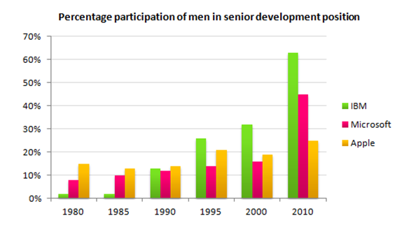
The bar chart shows the percentage of men in senior development position in three companies from 1980 to 2010.
While more men were in senior positions at Apple than other two companies in 1980 at 15%, the trend was fairly erratic with a 2% drop to 13% in 1985, followed by a rise of 1% five years later. In 1995, men held 7% more top development jobs than in 1990. After a slight drop back to 19% in 2000, by 2010 25% of top posts were filled by men. By contrast, at IBM men fared much better. In 1980, 2% of senior posts were occupied by men with no change five years on.
By 1990, the figure had increased to 13%, doubling to 26 per cent in 1995. Five years afterwards, there was a 6% increase in male senior development jobs with a near twofold jump in 2010 to stand at 63%, the highest for the three companies. The situation was less remarkable at Microsoft than the other two firms except for the year 2010. In 1980, the percentage of senior posts held by men was 8% climbing at the rate of 2% in each subsequent period until 2000, after which it leapt to 45%.
From the data, it is clear that men dominated senior posts at IBM by 2010.

The assigned pie charts illustrate the information about how much energy was produced from distinct sources between 1980 to1990.
Overall, it can be clearly observed that heftiest amount of energy in USA was derived from the oil in both years whereas with the passage of time its usage shrunk.
On analyzing the pie chart, it has been noticed that the proportion of energy from oil in USA during 1980 had stood at 42 which declined by 10% after a decade which was highest as compared to other sources. In initial year, this figure for natural gas was 26% and it fell down slightly with 1%. In the case of coal, the energy production accounted to be 22% which rose gradually upto 27% after ten years.
Not forgetting to mention nuclear power, the percentage of energy derived was witnessed to be 5 during 1980 which became double in 1990. Not so far behind hydroelectric power which produced minimum amount of energy at 5% in1980 and it remained stagnant in 1990.
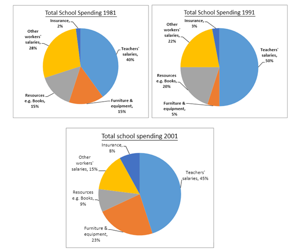
These three pie charts compare between the percentage of the annual expenditure in a certain school in the United Kingdom in three different years 1981, 1991, and 2001.
Firstly, tutors` salaries stood at two-fifths of the annual spending in the early 80s, increased by about 10% after one decade then slightly decreased to 45% by the beginning of the twenty-first century. Secondly, the payment of the other co-workers declined steadily from 28% in 1981 to 22% and 15% in 1991 and 2001, respectively. Furthermore, the amount of spending on furniture and equipment dropped dramatically from 15% in 1981 to almost 5% in 1991.
However, it rose to just below five times by 2001. On the other hand, the percentage of expenditure per year showed an upward trend in the three years from 2% in 1981 to approximately four times in 2001. In addition, the annual spending on school resources such as books fluctuated in the three years. Since it showed initial rose from 15% to 20% in 1991. Onwards it declined to just below one in ten.
To conclude, it can be clearly seen that teachers, salaries represented the major portion of the annual school expenditure in three years.

The two graphs depict different information related to complaints within the bank of America. The pie graph shows the sources of complaints, while the bar graph illustrates the average time taken between investigation into complaints and final action taken.
In general, by far the highest number of complaints against the bank of America originated from the public. The bar graph shows the average time period between investigation and action is around 5 months.
63% of all complaints against the bank of America are lodged by the public. Of the remaining 37% of complaints, the figures can be grouped into percentages between 11 and 8%, which are made up of government agencies, out-of-state agencies, and insurance companies. Then interestingly, media and bank employee made up and equal figure, 3% in the chart.
The bar graph shows that 2001 had the highest waiting time for complaints of medical misconduct at 6 months. Although there is a significant drop from 6 months in 2001 to 5 months in 2002, all previous and proceeding years display an average waiting period of 5 months. Despite this, over time the average waiting period is decreasing.
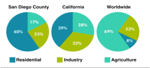
The given pie charts illustrate the amount of water consumption by citizens in San Diego, California and the rest of the world.|
Overall, the water usage for residential account the most percentage in San Diego Country, agriculture in this country uses the less water. In contrast, the rest of the world spends most of water usage in agriculture, also, the less use of water fall in residential category.
California had a nearly equality in water consumption for three categories which are residential, industry and agriculture. In California and San Diego, residential water consumption took up a large amount, in percificly, 60% and 39%. By contrast, only a fraction of 8% in home water usage in the rest of the world.
The opposite trend can be seen when agriculture constituted a massive 69% in water consumption in the rest of world but in San Diego and California, it only account for 17% and 28% the amount. For industry water consumption, all three countries spend all most the same amount of water usage. San Diego Country and the rest of the world have an equal amount of water usage of 23%. California uses 10% higher at 33%.
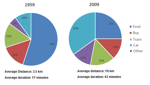
The pie charts delineate how citizens in a European city commuted to and from their offices in 1959 and 2009.
Overall, more than half of the office-goers walked in 1959 while car use in 2009 significantly increased. Besides, people travelled more distance in 2009 at a faster speed.
According to the illustration, more than half of the job holders walked to reach their office and get back home in 1959 while only a quarter of them did so in 2009. Bus commuters in this city accounted for 15% in 1959 while it was 2% less after 5 decades. The ratio of office executives (15%) who used trains in both years remained the same. One in ten office commuters drove cars in 1959 but after five decades their percentage increased significantly, 35% to be exact.
The use of different other transportations in 2009 increased than that of 50 years earlier. It is worth noticing that the speed and average distance travelled by these commuters considerably increased in 2009 when a commuter travelled 19 kilometers on an average in 42 minutes compared to their average 3.5-kilometre journey in 17 minutes in 1959.

The table provides information about different types of independent films released in the UK and the Republic of Ireland in 2012. It indicates how many films of different genres were made and also shows what proportion of total ticket sales was made by each kind of film.
The table makes it very clear that there is no correlation between the number of films made in any category and the proportion of ticket sales earned by that sort of film. For example, the largest numbers of films were made in the Drama and Documentary categories - 35 of each of these were released. However, they earned only 8.3 and 2.9 percent of total ticket sales respectively.
Comedy films were the most financially successful: 26 films, out of a total of 148, earned 45.4 percent of all the income from ticket sales. Another very successful type of film in 2012 was the biopic. Although only one of these was released, it accounted for 9.1 percent of ticket sales.

Model answer:
This table clearly presents and compares favorable pastimes in eight different countries. The pastimes, across the top of the table, are analyzed in relation to each country.
As can be seen, about 60% of Canadians, Australians and Americans like watching television. On the other hand, this figure is quite low for China where only 15% of people watch television. Predictably, Americans like music at 23%, whereas only 2 to 5% of people in the other countries feel the same way. 20% of people in England enjoy sleeping as a pastime whereas in Canada and the USA, for example, the figure is only 2%. Interestingly, the Chinese like hobbies the most at 50%, as opposed to only 20% in France. It isn’t surprising that the highest percentage of beach-lovers is in Australia and the USA at 30%.
It seems that pastimes of people of different nationalities may be influenced by a number of factors such as the socio-economic situation or the climate. These factors influence cultural differences between different nationalities and make cross-cultural experiences more interesting.

Model answer:
The two tables contain sales data for Fair-trade tea and pineapples in 2010 and 2015, in five nations of Europe.
The first table shows low-level tea sales increasing in all five countries, albeit to widely varying degrees. In two places sales increased by the same small amount: 2.8-3 million Euros in Germany, and 1.8-2 million in Norway. The increment was slightly larger in Netherlands, from 2-2.7 million Euros. Meanwhile, in Austria sales doubled from 4-8 million Euros. Finally, in France there was an enormous increase, from 2.5-21 million Euros.
In the second table, it is Austria which stands out as buying far more Fair-trade pineapples than the other four countries. The sales figures for Austria jumped from 16-48 million Euros across these five years, while in France and Netherlands sales only grew from 2-6.5 and from 1.6-5 million Euros respectively. Norway and Germany showed a different pattern, with falls in pineapple sales from 2.8-2 and 3-1.9 million Euros.
Comparing the two tables, it is clear that in 2010 Fair-trade tea sales ranged from 1.8-4 million Euros in these five countries, while pineapple sales also mostly clustered between 1.6 and 3 million Euros, with Austria the outlier at a huge 16 million Euros. By 2015, sales figures for both products had risen across the board, except for Norway and Germany which recorded drops in pineapple sales.

The provided pie chart depicts the information about the proportion of various modes of transport while the table shows the reasons of opting car in Edmonton.
Overall, the highly preferred mode of transportation among people is car whereas it is used the most for commuting to work.
On analyzing the pie chart, it can be witnessed in the upshot that majority of individuals like to travel on car at 45%. This figure for LRT is also high at 35% as opposed to the least of bus and taxi having 10% users for each.
Turning to the tabular chart, it has been noticed that the major reason of choosing cars for people is work with 55% users. While, the proportion of people involved in business who use cars accounts as 45. Not so far behind, the ratio of car commuters who take their children to school is found to be 45 which is three folds high than remaining two categories of car preferring individual at 15.
be witnessed in the upshot that majority of individuals like to travel on car at 45%. This figure for LRT is also high at 35% as opposed to the least of bus and taxi having 10% users for each.
Turning to the tabular chart, it has been noticed that the major reason of choosing cars for people is work with 55% users. While, the proportion of people involved in business who use cars accounts as 45. Not so far behind, the ratio of car commuters who take their children to school is found to be 45 which is three folds high than remaining two categories of car preferring individual at 15.
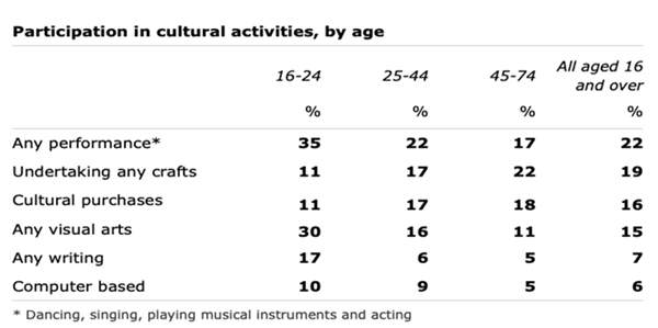
The table illustrates the results of research undertaken in Scotland with adults aged from 16-74 to assess their involvement in a variety of cultural activities over a 12-month period.
Overall, it is evident that participation in any performance and crafts were the most popular for all age groups.
The highest participation in any activities was seen in the 16-24 age group, with 35% and 30% respectively doing performance and visual arts. In contrast, other activities were much lower, particularly those computer-based, at only 10%. Turning to the older age groups, like the under 25s, the highest participation rate seen for 25-44 years olds was in performance, though this was much lower, at only 22%. A similar rate of 22% was evident for the most popular activity for the 45-74 age group, which was crafts.
Again, the popularity of computers was very low for all those who were 25 plus, as was interest in writing. Taking all age groups together, it can be seen that performance and crafts were the most popular, at over 19%, whereas cultural purchases and visual arts were slightly less popular at 16% and 15% respectively. Finally, little interest was shown in writing and computing.

The given maps illustrate how the museum and its nearby area changed over the period of five decades. Overall, it is clear that the area undergone various changes along with expansion of area of the museum throughout the given time span.
Looking at the surroundings of the museum in 2007, the removal of the trees can be seen than that of 1957 from the roadside and greenery around the museum also reduced as the area of museum was extended. The driveway leading up to the museum had also been removed and car park has been built by the roadside after fifty years.
Moving to the museum building, in 1957, the entrance of the museum was located in the middle of the building which shifted to the left side of the building in 2007 where a new shop had been built from there, the visitors could enter into a new reception room. The cafe had been constructed at the place of museum storage room and national history exhibition room was turned into local history room. Two new rooms were added namely special exhibitions and education centre in 2007.
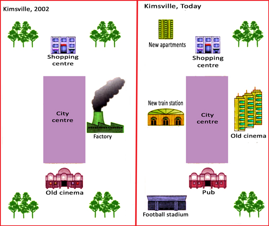
The supplied maps compare the changes that took place in the Kimsville town recently compared that of 2002. Overall, less tress could be observed in the recent maps of the Kimsville town while new establishment like football stadium, large cinema hall, train station have been built.
According to the map that represents the Kimsville of 2002, the city centre was in the middle of the town and factory was in the right side of it. More trees were visible in this graph and the old cinema and shopping center were two most significant establishments in this time.
Today, the map of Kimsville has changed a lot including the new high rising apartments, train station and football stadium. The old cinema hall building was transformed in to a pub while a larger cinema hall was established. The city centre and shopping centre remained at the same locations while the number of trees has decreased now. The new football stadium and apartments occupied the places where more trees were present in 2002.
Model answer
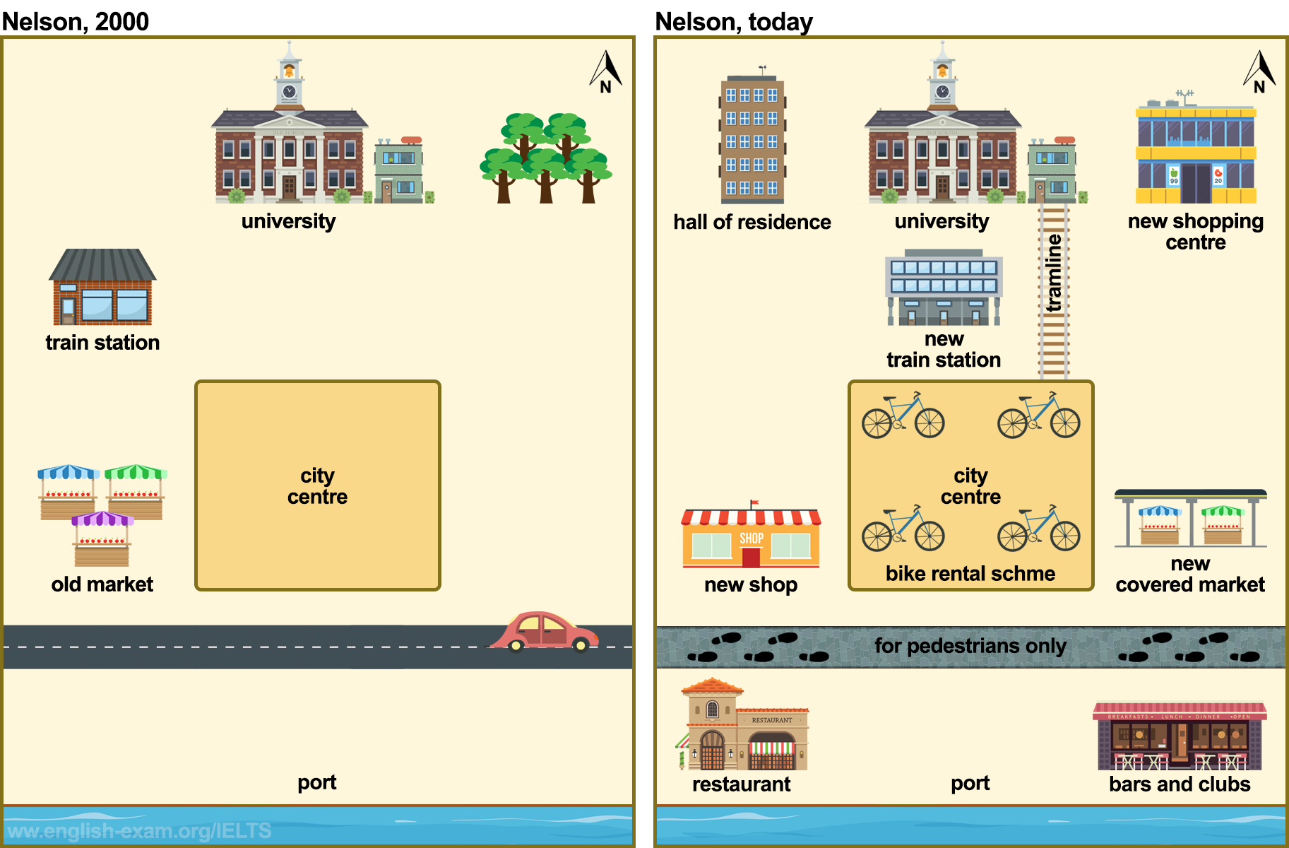
The two maps show the main changes which have taken place in the town of Nelson between the year 2000 and today.
In general, it appears that Nelson has become a much more modern city, with far more shopping and transport facilities.
One interesting change is that a new trans line has been built, to connect the university with the town centre. In 2000, there wasn't any accommodation for students, but a hall of residence has been built near the university. Another striking change is that the old market in the west of the city has been knocked down to make way for new shops. A completely new covered market has also been built on the other side of town.
If we look at the port area, it has been pedestrianized since 2000, and a range of entertainment facilities have been built, such as restaurants, bars and clubs. The north-east of the city used to be a green area, with lots of trees, but the trees have been cut down, and a new shopping complex has been constructed. A final interesting development has been the introduction of a bike-rental scheme in the city centre.
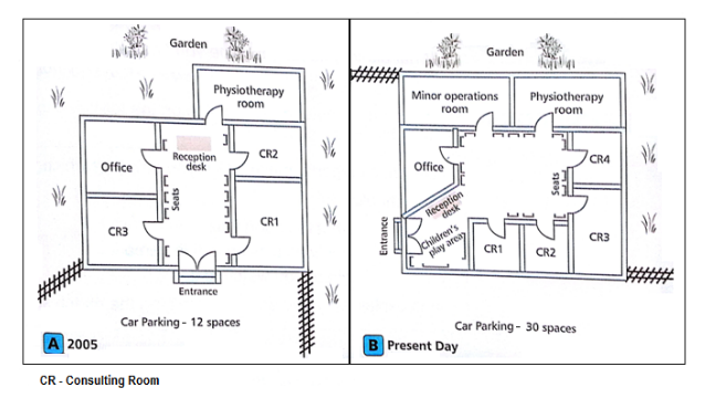
The map indicates several significant changes in a center from 2005 to the present day.
Overall, it is clear that while there have been two new rooms constructed, some of the existing rooms have had a change in their locations.
In 2005, the main entrance was located in the front of the building, leading to a waiting chamber with seats on two sides and a reception desk at the end of the room. In the present, only Physiotherapy and Office room have remained, the entrance is relocated to the left corner of the center to make room for the CR1 and CR2 rooms, combined with the move of the CR3 room to the right corner of the building. Next to the the entrance, the Reception desk is also situated and a leisure area has been built for children to play.
In the present day, a Minor operations room has been erected behind the Office chamber, and a new CR4 room has been placed between the CR3 room and the Physiotherapy one. Finally, the capacity of the car parking in the front of the center is expanded from 12 spaces in 2005 to 30 spaces these days.

The maps provide a comparison of the state of the town of Stokeford in 1930 and 2010.
Overall, Stokeford increased significantly in size over the period with house replacing areas that used to be farmland.
Stokeford is situated on the east side of the River Stoke. In 1930, there was one main road going through the town from north to south. Along each side of the road were some houses, some shops, a post office, and primary school. By 2010, the post office still remained, but the shops had been replaced by more houses. There were also new roads built to connect the new houses to the main road. Moreover, the primary school had been enlarged and even more houses had been built to the west of the town in an area that was farmland in 1930.
To the southeast of the town, there were some public gardens with a large house, but this was converted into a retirement home sometime over the period. Finally, the farmland that had been to the south of the town was also converted into a new housing area
There are, sadly, still many conflicts in today's world. Some people suggest that if we had a better understanding of other people's culture, the world would be a better, more peaceful place. How then can we heighten our awareness of cultures which differ substantially from our own?
The starting point of our development is at home and at school. While we would expect, naturally, to be brought up at home within our own culture, school would seem to be the place where we should begin to be exposed to the world outside. School subjects such as religious studies, geography and history can be too limited in terms of their content Perhaps these subjects should cover a wider curriculum or alternatively perhaps schools could introduce 'culture' as a school subject. Certainly, we need to get children interested in this topic if they are too develop a better understanding of other cultures in the future.
While educating young people should help in the future, there would seem to be a need for more immediate measures. Fortunately, today we have access to technology which facilitates easier communication across borders. Large media companies who broadcast via satellite and companies with a powerful online presence are in a position to educate and inform us about societies other than our own. Although we occasionally see interesting documentaries on culture, they are not common. Perhaps, if we were to be shown more quality programmes on this issue, more people would become more interested in it and this, in turn, would lead to an increase in our awareness.
Though it is sometimes difficult to fully understand cultures which differ significantly from our own, it is by no means an Insurmountable task. By raising our level of interest, and our children's level of interest, through education and educational programmes we should be able to arrive at a place of better cultural understanding.
Is it advisable to approach unreached parts of the global to fulfill global energy needs? Considering threat to environment, decline in usage of ecofriendly sources, I find above argument to be flawed.
Exploration of new places for fuels can be environmentally hazardous this is because extracting fossil fuels involve vigorous process of mining and industries establishment which not only leads to release of toxic gases in case of digging processes , but also exhaustion of noxious chemicals from industrial process, thereby, depleting the atmosphere. A study published in express journal revealed that approximately 60% suburbs of Dubai have polluted air index because of recent fuel extracting procedures.
In addition to this, discouragement of renewable sources would take place. As petrol, diesel and other non-renewable fuels will be availed to masses at any cost people would hardly prefer to the solar energy and wind energy, resulting in permanent degradation of fossils from earth. For example, had Finland’s governing bodies’ not availed diesel driven stations in eastern part for agricultural purposes it would have chosen wind mills for same purpose like southern part.
In conclusion, owing to deterioration of environment and alleviation in utilization of environmentally safe sources. I believe it is not worth appreciable to discover new places for accessing fuel resources.
It is always been matter of concern which out of two contributes more in the welfare of society -grey generation or youngsters. Admittedly, extreme expertise favours the former; however, considering high work efficiency and potential to bring change, I believe latter has an edge over it.
Undoubtedly, there are numerous reasons why senior citizens are required for the growth of mankind. The most salient one is the in-depth knowledge and experience exhibited by them. To elaborate it, old age people have already confronted extreme adversities throughout their life which outshines them as critical thinkers, making them capable for taking rational decisions. Therefore, young ones become competent to pave a path of success under the valuable guidance of their seniors.
Paradoxically, a vast majority of echelons across the world greatly admire youth dint of several aspects. The first and foremost is growing generation are infused with the physical and mental abilities to present positive and consistent outcomes. To explicate it, youngsters are holistically fit to endure the pressure exerted by the overwhelming competition to improve the global economical status. Thus, working capacity of young blood helps them to fetch the financial gains for community.
Additionally, young minds can introduce interesting and rare ideas to break the monotony of traditional working criteria. To put it easily, their enthusiasm and desire to prevail ambition motivate them to perform exceptionally well in all spheres. Consequently, hard work coupled with internal encouragement pushes young individuals to polish themselves to upgrade their standard of living by modifying the pre existing believes and norms around themselves to engender the prosperous environment.
In conclusion, although prolonged learning from life inclines the focus towards the older generation, not only holistic endurance but also confidence to implement new policies incline the focus towards youngsters.
It is always been a contentious issue that whether presence of less number of languages can make life more convenient. Although cultural exploitation opposes this idea, considering ease of communication and elimination of heterogeneity, I believe above notion to be fruitful.
Admittedly, having single language of conduct gives birth to the considerable issue of extinction of cultural believes. To explicate it, culture of particular place has a direct link with the language of that region creating sense of honour regarding country which may get broken with the omission of language. Therefore, few echelons opine that invisibility of language may defenestrate the prolonged cultural morals and feelings.
Paradoxically, another significant argument acknowledges that one single language system acts as a precursor of several benefits for mankind. The first and foremost is the convenient communication among the dwellers of distinct localities. To make clear, when everyone has similar way of conduct then languages barriers would be negligible as compared to multiple language systems. Consequently, conversations would be effortless as speakers need to put less endeavour while talking.
Additionally, use of one language promotes the homogeneity around the globe. To put it easily, if people have same language then interaction among those would enhance amalgamating the nexalite thoughts present in their mind by understanding the view point of others. Hence, it would leads to the both outcomes including suppression of emotional aversion and spread of integrity.
In conclusion, the adversity of culture loss presents the negative of one language all over the world. Owing to relaxing conversations and reduction in hate, this trend can be considered useful.